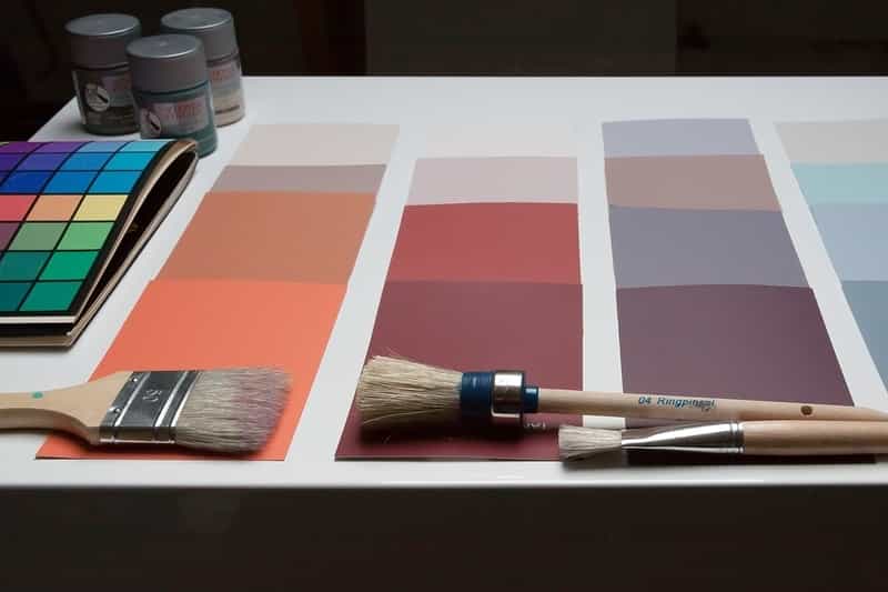
When it comes to choosing colors for our homes, our process of choosing takes more into account than just how we like the look of the color.
Certain homes need certain colors to bring out spaciousness in the walls, and certain rooms can get away with darker, more atmospheric colors in order to bring them in and make them feel cosier.
Away from the interior aspect, color plays a crucial role in our lives because it’s emotive. It can directly influence how we feel when we’re in a space, changing our moods and even making us feel colder or warmer.
That’s why the process of getting the right color scheme is a decision that can never be taken lightly.
As 2020 draws to a close, our minds now move into the dominating color schemes across 2021. This year has seen us all spend more time at home than ever before, and for many of us it’s meant a whole host of home projects have finally been completed!
Houzz, an online remodelling programme, even saw a 58% uptick in its users across 2020 as more people than ever before searched for new home ideas.
So as we now get prepared to welcome in 2021, which colors have been decided to dominate the new year?
1. Calming Ground Tones
Already identified as Dulux’s Color of the Year for 2021, it’s no surprise that Brave Ground has already been chosen to lead the way next year.
Warmer shades are both neutral and comforting – something that we have all sought in plentiful abundance throughout the turbulent year of 2020.
Earthy shades are colors that aim to create safe, warm and natural spaces in which people can draw upon the calming influence of nature to gather strength, courage, and create a haven from the unpredictable world outside.
Plus, it pairs incredibly well with accessories that also stick to the minimalist, earthy feel. Lacquer bowls made from wood and hand finished with layers of natural tree sap lacquer are the perfect table complement to a dining room adorned in earthy finishes.
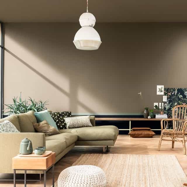
(Source – Brave Ground by Dulux)
As well as shades of olive and latte, deeper earthy shades with deeper hues of browns and nettle greens are also pipped to be sought after throughout 2021.
Deeper brown shades are known to give a more luxurious and highly premium feel to interior spaces like living rooms, dining areas and entrance halls. Not only does the shade help to create a chic and contemporary color scheme, shades such as deeper browns are seen as restful and stimulating.
Together they help to curate a sense of balance and calm, ensuring that your interior will both rejuvenate and refresh you after a long day.
2. Rolling Green Landscapes
Perhaps a surprising addition to interior design trends, shades of green are slowly transitioning their way into popularity from 2020’s previous hot trend of shades of grey.
Just as with earthy ground tones, green is a shade synonymous with nature and feelings of calm serenity due to its links with nature. Varying shades of mottled nettle, luscious grasses and deep velvet greens have powerful restorative qualities and aid contemplation and mindful thought.
It’s recommended that for color schemes adorned in greens, the walls should represent a landscape of rolling meadowlands and pasture fields.
This type of color scheme means that no matter where you live, whether out in the country or settled in the suburbs, painting the walls green will take you one step closer to nature.
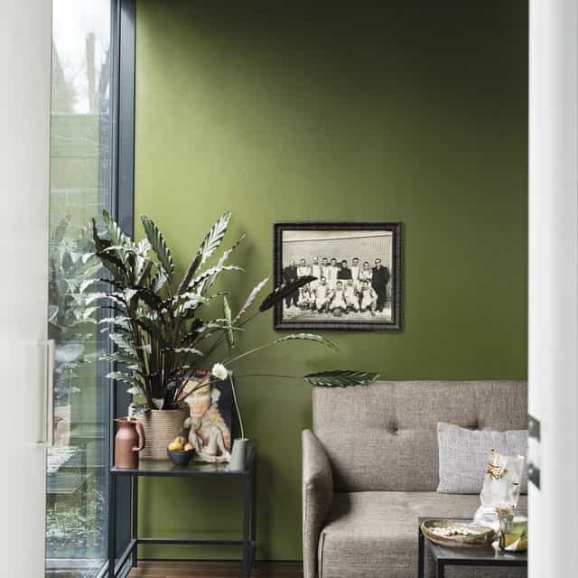
Olive is another particular shade of green that is seeing a resurgence of popularity in bedrooms. Interior design experts have long stated that shades of olive green can help to create a serene environment, which is vital to help us relax in our bedrooms and get a good night’s rest.
Pale olives can also accentuate grey accents and accessories, like furniture or wall posters. The combination is seen as peaceful, and when combined with a tonal palette can give the walls a harmonious feel.
Meanwhile if you’ve got east-facing or north-facing rooms, consider a darker olive green. By nature east-facing spaces often come with bluey green undertones which olive green can help to highlight, whilst it can embrace and warm north-facing rooms who often suffer from lack of light.
3. Warming Rustic Reds
Off the back of 2020’s uncertainty not only has it prompted a resurgence in natural colours, it’s exacerbated the need for warmer hues too.
Whereas 2020’s Instagrammable trends of charcoal greys and navy blues promoted a much colder, fresher outlook, 2021 moves back into embracing warm colours to create a rustic, manor house library type cosyness.
Of course to promote this atmosphere we welcome back deep reds and luxurious plums. These rich hues remain chic through the day and then become cosy at night, mixing luxury with intimacy.
Winner of Graham & Brown’s Colour of the Year 2021, Epoch is a color designed to do just that. The deep shade of plum leaves us wanting to hunker down throughout the winter, warming us, calming us, and most of all relaxing us.
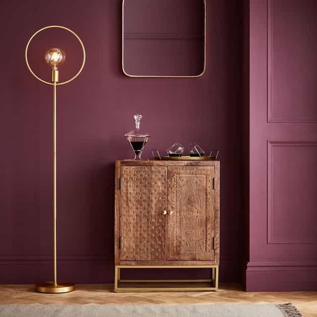
On the topic of rustic reds, another color that saw its popularity increase throughout 2020 and which looks to continue into the new year is terracotta clay.
Pinterest revealed that searches for ‘terracotta walls’ increased by 86% YoY last year. Although a general term, terracotta encompasses shades of pinks, burnt oranges, gentle ochre and stormy black.
Again these colours promote both a natural appearance in line with the Mediterranian style of home, whilst also keeping a sense of gentleness and warmth.
4. Bright Beiges
Although the events of 2020 have left us scurrying to embrace more warmer, calming colors, it’s not all been doom and gloom. In fact, off the back of these events bright beiges are starting to shine through as a sunshiney, golden lining.
A new color palette of beiges have been curated under the umbrella of an ‘Earth Collection.’ One of the tones, Crocky Road is already being tipped to be sought after by homeowners.
The cool, natural beige contains a very faint green undertone to continue along the naturalistic calming and easy going connotations of the aforementioned green color schemes. Perfect for both modern and traditional homes, it’s being recommended to be paired alongside a whole host of bright accessories to really accentuate the various colors.
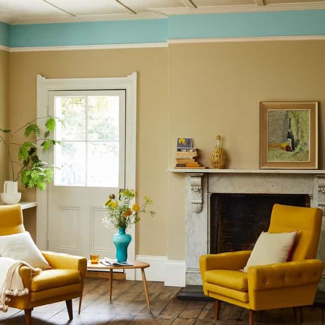
(Source – Crocky Road by Earthborn)
Neutral wall colors have long been associated with creating softer, warmer, and most notably – larger, living spaces. Its ability to bring out rooms is also being hailed as a reason as to why so many may flock to these bright wheat colors throughout 2020.
As we’ve all been cramped and living on top of one another, or sufficing in a work environment that is not spacious nor suitable, it makes sense as to why we’d want to let our rooms breathe just a little more.
Also on the rise are milky and almond neutrals. These colors are known for providing a sense of timeless elegance to a room and also create the perfect stage to complement darker furniture pieces or other homeware accessories..
Experts are recommending that colors like Oak Apple, Mushroom and Bath Stone will become the go-to tones as people aim to create restful, bright and warm living spaces with feelings of comfort adorned throughout.
To conclude:
We hope you’ve enjoyed this look at the top trending color schemes for 2021. It appears as we enter into a new year that we all hope is much more stable, colors that can promote feelings of warmth and calm with preside over previous colder, more detached colors of blue and grey which dominated the 2020 interior design market.
All of the four color schemes offer great opportunities to create harmonious partnerships with decor. As much more rustic, naturalistic and sustainable homeware items become desired by homeowners, colors such as neutral beiges or deep reds can complement these pieces perfectly. This creates an overall atmospheric feeling of warmth and elegance, making our properties look both cosy and timeless.


