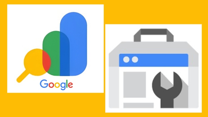
Google recently rolled out a new logo for Google Search Console, surprising many users. The redesign aligns with Google’s material design principles and reflects its modern branding.
Why the Logo Change Matters
Visual identity is key to brand recognition. The updated Google Search Console icon makes it more consistent with other Google products. This slight shift symbolizes Google’s ongoing efforts to unify its platform experience.
Comparing the Old vs. New Logo
- The previous logo featured a minimalist toolbox.
- The new logo follows a geometric style, similar to other Google tools.
- It now looks more like the icons for Google Analytics, Google Ads, and Google Tag Manager.
User Reactions to the New Design
Many users on platforms like Twitter and Reddit noticed the change immediately. Some praised the modern look, while others missed the old, familiar design. Overall, the update has been well-received by digital marketers and SEOs.
What This Means for SEOs and Webmasters
Though the logo update may seem cosmetic, it reflects deeper alignment with Google’s UX. For SEOs, this is a reminder that tools evolve. Staying updated is key.
Does the Logo Change Impact Tool Functionality?
No, the core functionality of Google Search Console remains unchanged. You’ll still find:
- Performance reports
- Index coverage
- Sitemap submission
- Core Web Vitals insights
The tool still delivers the same valuable insights, only now with a fresh coat of paint.
How to Spot the New Logo
The updated icon appears:
- On your Google Search Console dashboard
- In your Google apps menu
- On browser tabs when the tool is open
If you haven’t seen it yet, try clearing your browser cache or updating your Google account view.
Rebranding Trend Across Google Tools
Google has slowly rolled out new logos for:
- Google Drive
- Gmail
- Google Meet
- Google Calendar
This unified aesthetic builds a stronger visual identity across its ecosystem.
Logo Design and Brand Trust
A consistent logo theme improves brand trust. Google’s redesign helps users identify tools quickly and trust the reliability of their platform.
Tips to Adjust to the New Design
- Don’t panic if the icon looks unfamiliar.
- Double-check browser tabs for the updated favicon.
- Bookmark the official Google Search Console URL for quick access.
Staying Updated with Google Tools
The logo change shows how fast platforms evolve. Make it a habit to follow:
- Google’s official blog
- SEO news sources
- Search Console release notes
Conclusion
The new Google Search Console logo is more than a visual tweak. It reflects Google’s commitment to a unified, user-friendly design. While functionality remains intact, the sleek look aligns it with Google’s broader branding strategy.
FAQs
1. Why did Google change the Search Console logo?
To align with its material design and unify branding across all products.
2. Will the new logo affect Search Console features?
No, all tools and features remain unchanged.
3. How do I update to see the new logo?
Try clearing your browser cache or refreshing your dashboard.
4. Does the logo look like other Google tools now?
Yes, it now follows the same modern, geometric design trend as other Google apps.
5. Where can I learn about more Google updates?
Check Google’s official blog and follow SEO news outlets for regular updates.


